
Customers usually opt for a new, better app if the design is slow, undesirable, or challenging to get used to with it. Designers can often land in complicated situations if they don’t maintain consistency throughout the working life of an app. It might also make it difficult for them to keep users attracted for the longer term. It’s challenging to design an app with intuitive simplicity without it becoming repetitive and boring. An app has to offer pleasing design and UX details without losing sight of a higher purpose.
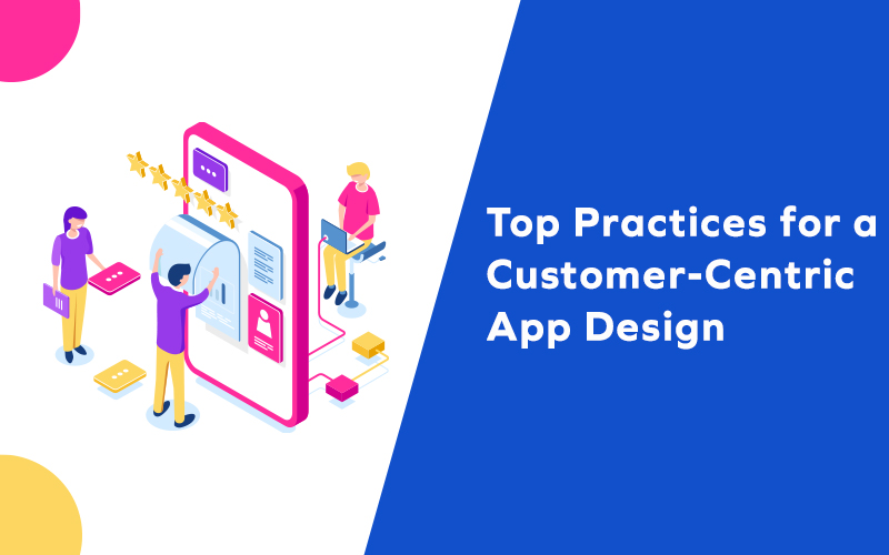
Basic App Designing Practices for Great First Impression
The proper balance for first impressions can be a lengthy onboarding process to discover necessary features and the ones that may bore users. Creating an intuitive app that introduces engaging features and yet doesn’t confuse them is a delicate balancing act. Here are some tips for maintaining that balance:
Screens and Elements
Loading screens are still a vital part of an intuitive mobile app design experience and need careful handling. It can signify that, when faced with a loading screen, provide entertainment in the form of subtle animations. While the screen loads data, you can also display skeleton screen wireframes for showing a format. Skeleton screens can instill a sense that the data is loading faster. This also includes button sizes, texts, and other elements of design, and designers must consider the keyboard sizes too.
Visual acuity is also crucial that includes graphics, text, and color palettes, which should be viewable from a distance. Mobile app design elements should be large enough to be viewed from a reasonable distance and accurately touched with an average-sized finger pad. Most people hold their device, on the one hand, that means it should be accessible to all the reachable screen zones. Placing important features and frequently used elements in the bottom three-quarters of the screen will enhance user satisfaction.
Clarity of Intentions
A well-balanced design is a perfect concoction of having a clear purpose and intention. Instead of following an ongoing trend, designers can focus on solving a specific customer problem, catering to a niche, or providing a unique service. An app’s purpose impacts every step and decision right from the branding, the wireframing, and the button aesthetics. If the objective is clear, each piece of the app will communicate and function as a coherent whole.
When an app conveys such a vision to the potential users, they understand the value an app brings to their life. The idea needs to be clearly and quickly communicated from the user’s first impression to improve their experience, provide some enjoyment or comfort. Similarly, if they want to enter an already established market, they can study other apps as a baseline. The default onboarding flow might adequately inform early adopters who understand the solution and vision for the product. As more users come aboard, the standards can also become higher.
User Flow Optimization
Designers can focus more on the thoughtful planning of an app’s UX architecture before jumping into design work. Before they get into the wireframing stage, they can map out the user flow and structure of an app. Instead of delving deep into producing aesthetics and details, they can concentrate more on the necessary logic or navigation within an app. It is always better to slow down a bit and sketch out the flow of the app instead of worrying about the finer details.
The biggest reason for an app’s success is usually the convenience, organization, and user flow, rather than the details. However, as the process takes off, the big picture can always focus more on the aspects and aesthetics to evoke and reinforce the more significant concept. It is equally essential to build interfaces for those users who will don’t bother with the onboarding tour. This means designing natural elements that can be self-taught on first use.
Optimum Features
Rigorous wireframing and prototyping can make the distinction between necessary and excessive functions clear. Cramming unnecessary features in an app can lead to disoriented user experience, and also make it challenging to promote. Scaling down the elements is always hard, but it’s necessary to go with just two or three features initially to gain the users and momentum. Later, you can add more features that resonate with the users and test them.
This way, the additional features are less likely to interfere with the crucial first few days of an app’s life. Intricate UX design can create an environment of function creep that can occur when the product offers more features than customers need, confusing the users. Functional design advocates for clean and simple design elements, making it clear what the product or feature does.
Notifications and Context
Purpose and goals can also get irrelevant if they don’t have an appropriate context attached to it. The UI for a given app may seem obvious to the designers, but users from different demographics won’t find familiarity in it. Hence, it is always important to consider the immediate context or situation. You would also want to consider the duration for app-accessibility with regards to the content, and a way to convey it to the users while mapping out the flow.
Push notifications are another tricky part where users might turn them off entirely if they are too many, or too few. Apart from the frequency, the content is also essential while pushing out notifications. Useful notifications like daily check-ins are better than random updates about the news that doesn’t directly affect the user. Every notification is a microinteraction that can either enhance the user experience or even prompt them to delete the app altogether.
Testing for Consistencies
If designers want to introduce a new concept or standard, they also need to make it consistent across the app. Instead of implementing a new idea out of each piece of content, they can keep the uniformity across all sections of content. A uniform format also needs proper texts, UI elements behaving predictably, and a balance between consistency and pleasant features.
Design consistency must be a combination of existing common visual language and aesthetics. Designers can also analyze the use of their apps with a feedback loop to learn what is and isn’t working. It’s imperative to bring in fresh eyes to really dig into the drafts of the app instead of testing in-house. This can be a great way to iron out details, edit features, and find what’s missing. Beta testing can be a time consuming process, but it’s a better alternative.
Final Words
Mobile app design is as important to user experience as technical functionality. While the business logic of mobile apps appeals to our rational senses, app design appeals to our emotions and creativity. It’s important for design teams to recognize just how competitive the mobile app market is and to do whatever possible to differentiate their services as against the others occupying the same segment. a leading mobile app development company WeCode, aims to provide a coherent vision of what the mobile app is hoping to achieve. By following the above practices and developing an iterative design wireframe process that incorporates user feedback, our developers help you create an app that stands out in the crowd.